| Minimum Software Version | 8.18.10 |
| Solution(s) | Cases International ✓ Cases US ✓ Institutions ⨉ Counsel ✓ |
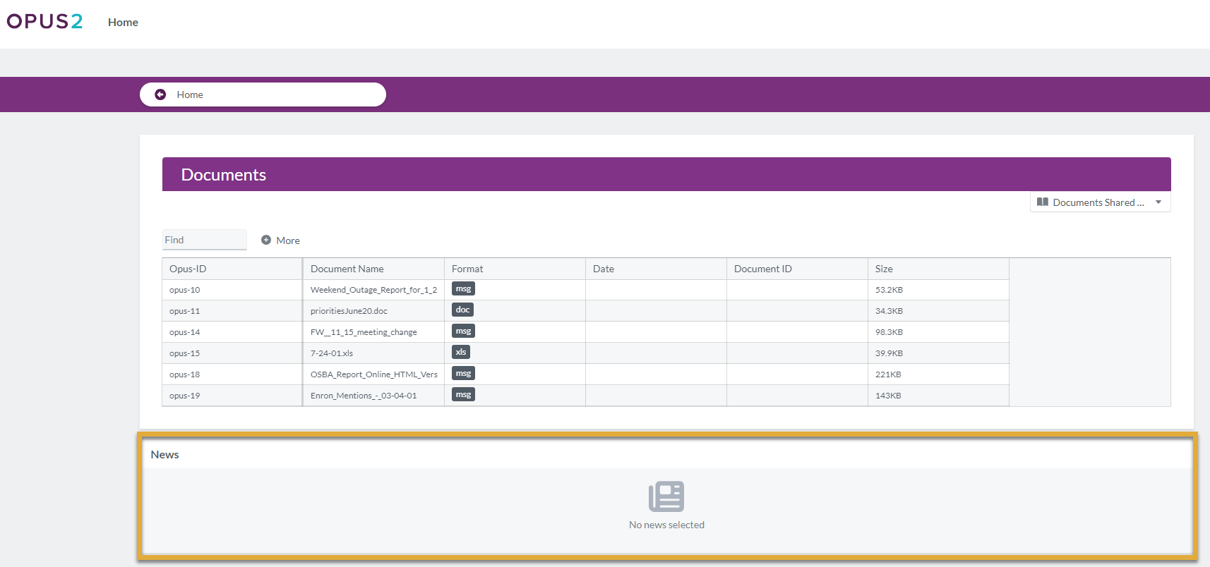
The News portal component allows users to share news items with portal users, helping keep them informed of updates, announcements, and important information.
The News component is designed to surface informational updates directly within the portal. It provides a simple, structured way to display news content under a configurable heading, ensuring portal users can easily stay up to date with relevant developments.
Administrators control the heading appearance and the amount of space the News component occupies on the portal page, allowing it to be used for brief notices or more prominent announcements.
Step 1: Add a News Component- Open the Portal Builder.
- Add the News component to the desired portal page.
- Open the Properties tab to configure the component.
Step 2: Configure News Properties
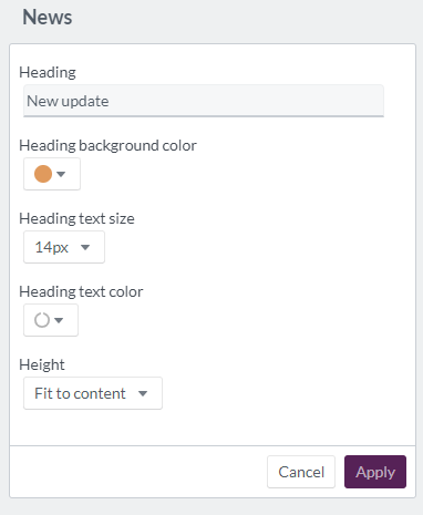
Configure the following options in the Properties tab:
| Option | Explanation |
|---|---|
| Heading | Heading text for the News component (maximum 100 characters). |
| Heading background color | Select the heading background color using a color wheel, hexadecimal, or RGB code. |
| Heading text size | Set the heading text size between 12px and 72px. |
| Heading text color | Choose the heading text color using a color wheel, hexadecimal, or RGB code. |
| Height | Set the display area to fit to content, at least half a page, or at least a full page. |
Example:
Configure a News component with the heading “Latest Updates”, a contrasting background color, and a half-page height to ensure visibility on the portal homepage.
Step 3: Portal User View
When displayed to portal users:
- The heading appears at the top of the component
- News content is displayed beneath the heading
- The component height determines how much information is visible without scrolling
Example:
Portal users see recent announcements related to case progress or upcoming milestones prominently displayed under the News heading.