| Minimum Software Version | 8.18.10 |
| Solution(s) | Cases International ✓ Cases US ✓ Institutions ⨉ Counsel ✓ |
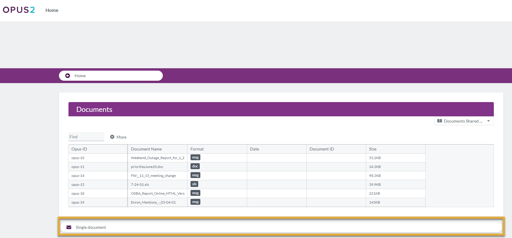
The Single Document portal component allows users to share one specific document from the platform with portal users, presenting it as a clearly identifiable and accessible item.
The Single Document component is designed for scenarios where portal users need access to a specific file, such as a key notice, agreement, or reference document. Administrators can select an existing document already uploaded to the platform or upload a new document directly through the component configuration.
The component supports multiple display formats and styling options, enabling consistent visual presentation and intuitive access for portal users.
Step 1: Add a Single Document Component
- Open the Portal Builder.
- Add the Single Document component to the desired page.
- Open the Properties tab to configure the component.
Step 2: Select or Upload a Document
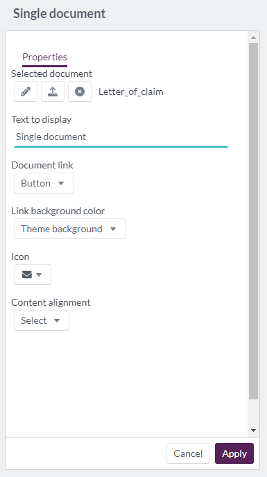
Users can manage the selected document using the available icons:
Pen icon:
Select a document that has already been uploaded to the platform.Upload icon:
Upload a new document that does not yet exist on the platform.- The document is saved in the Upload folder by default.
- Users may change the folder location if required.
- Documents can be added by dragging and dropping files into the upload box.
Cross icon:
Remove the currently selected document.
Example:
Select an existing PDF titled “Client Instructions.pdf” from the platform to share with portal users.
Step 3: Configure Display Properties
Configure the following options to control how the document appears in the portal:
| Option | Explanation |
|---|---|
| Text to display | Heading text displayed for the Single Document component (maximum 20 characters). |
| Document link | Choose how the document link is displayed: button, large button, card, or image. |
| Link background color | Select a background color from theme options or define a custom color using a color wheel, hexadecimal, or RGB code. |
| Icon | Choose an icon to visually represent the document section. |
| Content alignment | Align the component content to the left, center, or right. |
Example:
Display a large button labeled “Download” with a document icon and center-aligned layout.
Step 4: Portal User Interaction
When viewed by portal users:
- The configured heading text is displayed
- A clickable link (button, card, or image) provides access to the document
- Clicking the link opens or downloads the document, depending on browser settings
Example:
A portal user clicks the card-style document link to view an important notice.