
| Minimum Software Version | 8.18.10 |
| Solution(s) | Cases International ✓ Cases US ✓ Institutions ⨉ Counsel ✓ |
Explains how to add and configure the Input Form component in the Portal Builder, including worksheet and form preparation, property configuration, and the portal user input experience.
The Input Form component provides a controlled way for portal users to add new records to an existing worksheet directly from a portal page. By default, portal users can populate all fields in the worksheet. To restrict or guide data entry, administrators can create a form in the Worksheet Editor that includes only the fields intended for portal user input, ensuring consistency, accuracy, and appropriate access control.
Preparing a worksheet and form
Before configuring the Input Form component, ensure the following exist in the platform:
- The destination worksheet has been created in the project.
- (Optional but recommended) A form has been created in the Worksheet Editor containing only the fields portal users should complete.
Important: A worksheet is mandatory. Forms must be created in advance to be selectable in the Input Form component.
Example: Create a worksheet named Client Submissions and a form that includes only name, document description, and submission date fields.
Adding an Input Form component
- Open the Portal Builder.
- Add the Input Form component to the desired location on the page.
- Open the Properties tab to configure the component.
Configuring Input Form properties
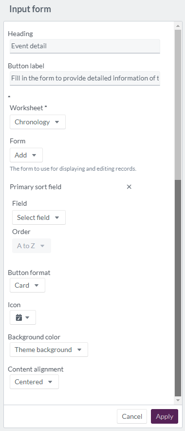
Configure the following options in the Properties tab:
| Option | Description |
|---|---|
| Heading | Header text for the Input Form component (maximum 20 characters). |
| Button label | Text displayed on the Input Form button (maximum 100 characters). |
| Worksheet | Required. Select the destination worksheet. |
| Form | Select a preconfigured form to control which fields portal users can complete. |
| Primary sort field: Field | Choose a field for primary sorting logic. |
| Primary sort field: Order | Set sort order to A–Z or Z–A. |
| Button format | Display the input form trigger as a button, large button, or card. |
| Icon | Choose an icon to represent the input form. |
| Background colour | Select a background colour from theme options or define a custom colour using the colour wheel, hexadecimal, or RGB code. |
| Content alignment | Align the component to the left, centre, or right. |
Example: Configure an Input Form with the heading New Entry and a large button labelled Add Record, using a restricted form view.
How the Input Form component appears to portal users

When a portal user selects the Input Form button, the Add Form dialog for the selected worksheet opens. Portal users complete the available fields as defined in the form, and the entry is saved directly to the designated worksheet on submission. All newly created records follow the worksheet's structure and validation rules.
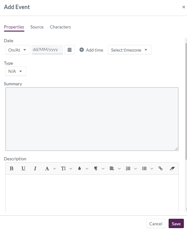
Example: A portal user submits a new client update, which is immediately saved as a new record in the Client Submissions worksheet.
Related links
Related documentation
Opus 2 has help information accessible within the application; click the question mark and then select Documentation in the upper-right area of the platform. You can also access the documentation at: Opus 2 Support.
How to contact us
To contact us about the documentation, or if you have any other questions or issues about Opus 2 solutions, contact Opus 2 Platform Support by emailing Opus 2 Platform Support.