
| Minimum Software Version | 8.18.10 |
| Solution(s) | Cases International ✓ Cases US ✓ Institutions ⨉ Counsel ✓ |
Portal pages in Opus 2 are highly configurable and are built using the portal page editor, which allows users to assemble content drawn from files, documents, and worksheets. Pages are created using a block-based, drag-and-drop interface that separates page structure, layout, and content editing into clearly defined panels.
The portal page editor is divided into three main panels:
| Panel | Purpose |
|---|---|
| Left-hand panel | Add sections and components |
| Middle panel | Build and preview the page layout |
| Right-hand panel | Edit the content and settings of selected components |
This separation allows users to design the visual structure of a page independently from the content it displays.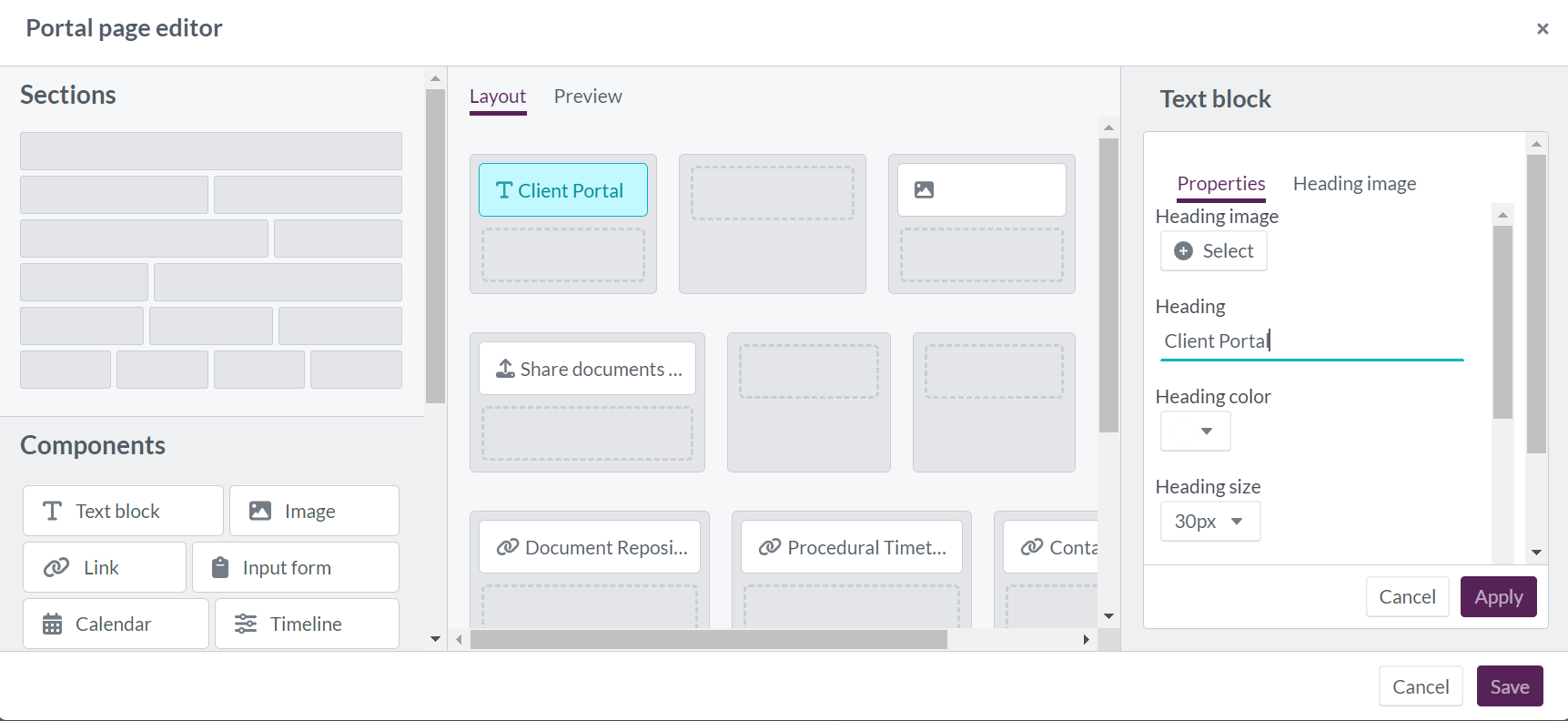
Left-hand panel: sections
Sections define the page structure. They are horizontal block layouts that determine how content is arranged across the width of the page.
Available section layouts include:
| Layout | Description |
|---|---|
| One column | Single section across the full page width |
| Two columns (equal) | Two sections of equal width |
| Two columns (2/3 – 1/3) | Two sections, wider on the left |
| Two columns (1/3 – 2/3) | Two sections, wider on the right |
| Three columns (equal) | Three sections of equal width |
| Four columns (equal) | Four sections of equal width |
Sections are added by dragging them into the layout and stacking them vertically to build the complete page structure.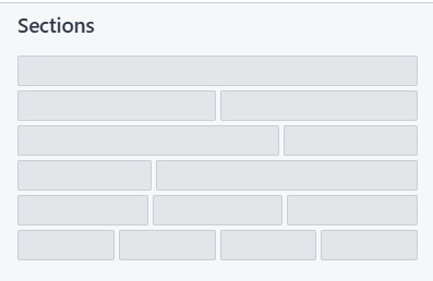
Left-hand panel: components
Components represent the actual content placed within sections. To add a component:
- Select a component type from the left-hand panel.
- Drag and drop it into an existing section.
- Configure its content after placement.
Some supported component types include:
- Text block
- Image
- Link
- Input form
- Calendar
- Timeline
- Worksheet
- Chart
- Cards
- Single card
- Documents
Each component has its own configuration options depending on its type.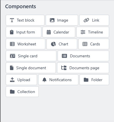
Middle panel: layout and preview
Layout
The Layout view is the design workspace where sections and components are positioned.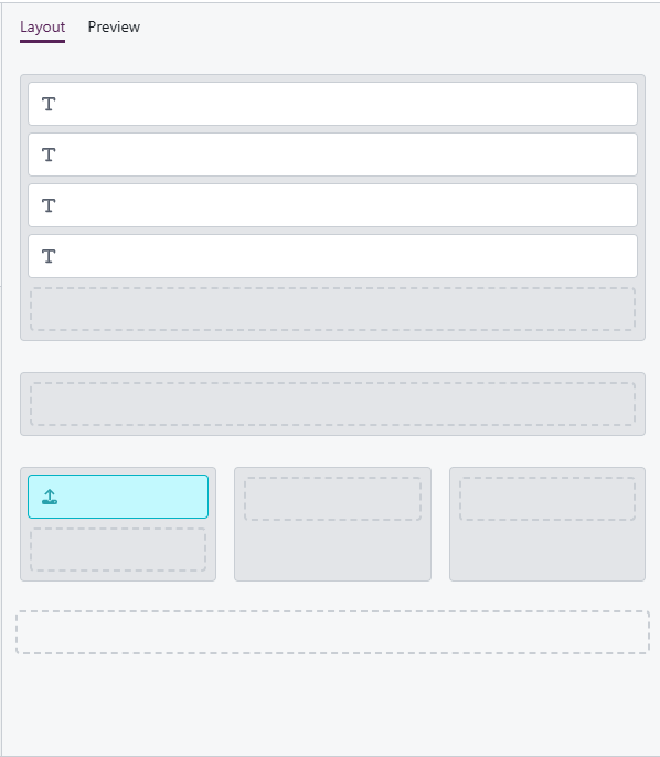
- Sections must be defined before components can be added.
- Both sections and components are added via drag-and-drop.
- Components appear as placeholders showing their type.
Preview
The Preview tab shows how the page will appear once published.
- Updates dynamically as changes are made.
- Allows users to review draft layouts and content before publishing.
- Ensures design and content are correct prior to going live.
Right-hand panel: component editing
The right-hand panel is used to edit the content and settings of a selected component.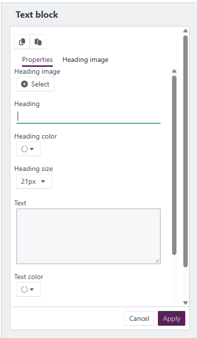
- Selecting a component in the layout opens its editor.
- Available options depend on the component type.
- Changes are reflected immediately in the preview.
Related links
Related documentation
Opus 2 has help information accessible within the application; click the question mark and then select Documentation in the upper-right area of the platform. You can also access the documentation at: Opus 2 Support.
How to contact us
To contact us about the documentation, or if you have any other questions or issues about Opus 2 solutions, contact Opus 2 Platform Support by emailing Opus 2 Platform Support.