| Minimum Software Version | 8.18.10 |
| Solution(s) | Cases International ✓ Cases US ✓ Institutions ⨉ Counsel ✓ |
The Calendar portal component allows users to share key case-related events with portal users in an interactive calendar view, enabling clear visibility of important dates and timelines.
The Calendar component presents events stored in the platform in a calendar-based layout, making it easy for portal users to track procedural steps, deadlines, and key milestones. Events are drawn from a configured worksheet that contains date-based data, and can be filtered, sorted, and displayed using predefined cards and forms.
Multiple calendar views—such as month, week, day, or agenda—give portal users flexibility in how they review upcoming and past events.
Step 1: Prepare Required Components in the Platform
Before configuring the Calendar component, ensure the following are created:
- A worksheet containing date-based fields
- At least one card for displaying records
- (Optional) A form if record detail views are required
Important:
The worksheet and date column are mandatory. Without them, the Calendar component cannot be configured.
Example:
Create a worksheet named “Procedural Timetable” with an event date column.
Step 2: Add a Calendar Component
- Open the Portal Builder.
- Add the Calendar component to the desired page.
- Open the Properties tab to configure settings.
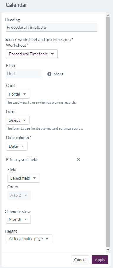
Step 3: Configure Calendar Properties
Configure the following options in the Properties tab:
| Option | Explanation |
|---|---|
| Heading | Heading text for the Calendar component (maximum 100 characters). |
| Worksheet | Required. Source worksheet containing the event data. |
| Filter | Apply filters such as date, party responsible, procedural step, status, date added, added by, date updated, or updated by. |
| Card | Required. Determines how records appear in the calendar view. |
| Form | Optional form view for displaying detailed event information. |
| Date column | Required. Select event date, date added, or date updated (event date is recommended). |
| Primary sort field: Field | Choose a field to control primary sorting. |
| Primary sort field: Order | Set sorting to A–Z or Z–A. |
| Calendar view | Default view: month, week, day, or agenda. |
| Height | Display size: fit to content, at least half a page, or at least a full page. |
Example:
Configure a calendar titled “Procedural Timetable” using the event date column and a card designed to show deadlines and responsible parties.
Step 4: Portal User Calendar Experience
When viewed by portal users:
- The heading appears at the top of the component
- A Find option allows searching events using metadata
- The More option enables advanced filtering
- Events display according to the selected card layout
Portal users can:
- View today’s events
- Navigate to previous or next periods using back and next controls
- Select a specific date using the calendar icon
- Switch views between month, week, day, and agenda
Example:
A portal user switches to agenda view to see a chronological list of upcoming procedural deadlines.
Display example of 'calendar' component: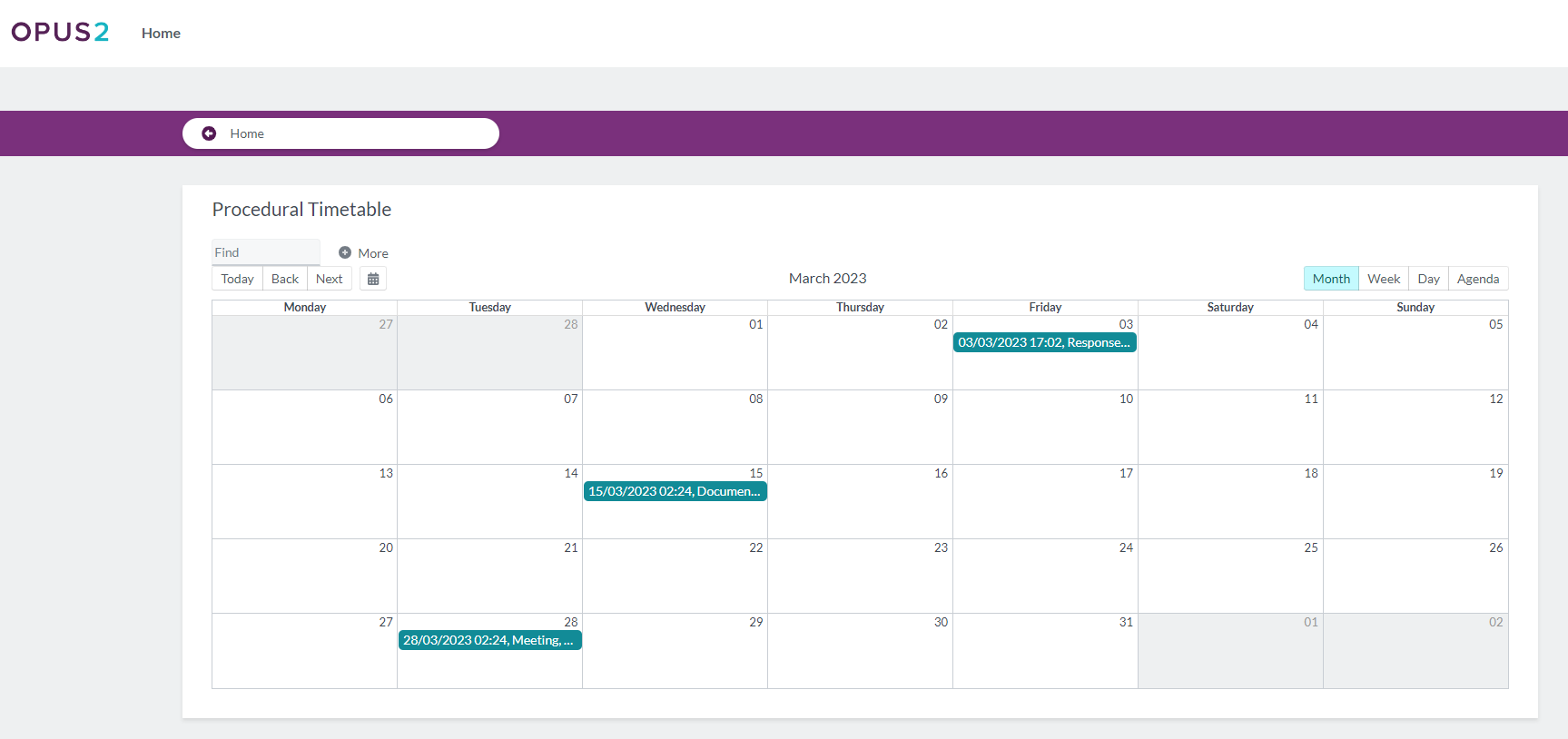
Related Links
Use the Calendar component to improve transparency and keep portal users informed of key case events through an intuitive, date-driven interface.