
| Minimum Software Version | 8.18.10 |
| Solution(s) | Cases International ✓ Cases US ✓ Institutions ⨉ Counsel ✓ |
The Upload portal component allows portal users to securely upload documents and share them with the legal team. Uploaded documents are stored in a predefined folder location within the platform.
The Upload component enables collaboration by allowing portal users to submit documents directly through the portal. Administrators configure the component by defining the destination folder, upload button appearance, and header styling.
To ensure consistency and avoid user confusion, a folder must already exist in the platform before it can be selected as an upload destination. Administrators can optionally allow portal users to change the destination folder, although best practice is to disable this option.
Step 1: Prepare a Folder in the Platform
Before configuring the Upload component:
- Ensure that a folder has been created in the platform.
- Confirm the folder appears as an available option for document storage.
Important:
The folder selection is a mandatory configuration step. Without an existing folder, the Upload component cannot be completed.
Example:
Create a folder named “Client Uploads” to store all documents submitted through the portal.
Step 2: Add an Upload Component
- Open the Portal Builder.
- Add the Upload component to the desired page.
- Open the Properties tab to configure settings.
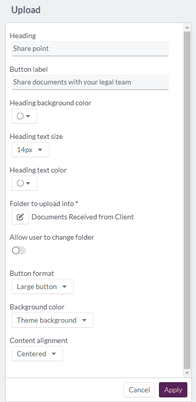
Step 3: Configure Upload Properties
Configure the following options in the Properties tab:
| Option | Explanation |
|---|---|
| Heading | Header text for the Upload component (maximum 100 characters). |
| Button label | Text displayed on the upload button (maximum 100 characters). |
| Heading background color | Select a color using a color wheel, hexadecimal, or RGB code. |
| Heading text size | Set size between 12px and 72px. |
| Heading text color | Choose a color using a color wheel, hexadecimal, or RGB code. |
| Folder to upload into | Required. Select the folder where uploaded documents will be stored. |
| Allow user to change folder | Allows portal users to select a different folder. Best practice is to disable this option. |
| Button format | Display the upload action as a button, large button, card, or image. |
| Background color | Choose from theme background, white, site primary/secondary color, or custom color. |
| Content alignment | Align content left, center, or right. |
Example:
Create an Upload component titled “Upload Supporting Documents” with a large button labeled “Submit Files” and a fixed destination folder.
Step 4: Portal User Upload Experience
When a portal user clicks the Upload button:
- An Upload Document dialog box appears.
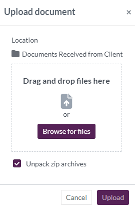
- The selected folder location is displayed, indicating where documents will be stored.
- Users can:
- Drag and drop files
- Browse their device to select files
- Enable Unpack zip archives when uploading multiple documents in a compressed file
Example:
A portal user uploads a ZIP file containing multiple PDFs and selects Unpack zip archives to automatically extract them into the target folder.
Display example of 'upload' component:

Related Links
Use the Upload component to streamline document collection and securely receive files directly from portal users, ensuring all shared documents are organized in the correct location.