
| Minimum Software Version | 8.18.10 |
| Solution(s) | Cases International ✓ Cases US ✓ Institutions ⨉ Counsel ✓ |
The Link portal component allows users to attach links to portal pages or external web resources and present them in multiple visual formats such as buttons, cards, or images.
The Link component is used to guide portal users to additional information, either within the same portal or to external websites. When configuring a link, users can choose the destination type—portal page, external URL, or unset—and customize how the link is displayed, including layout, icon, color, and alignment.
The component supports multiple formats (button, large button, card, or image), enabling consistent navigation and an improved user experience across portal pages.
Step 1: Add a Link Component
- Open the Portal Builder.
- Add a Link component to the desired page.
- Open the Properties tab.
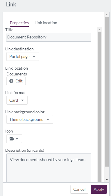
Step 2: Configure Properties for a Portal Page Link
When linking to an internal portal page, configure the following options:
| Option | Explanation |
|---|---|
| Title | The title text of the link component (maximum 100 characters). |
| Link destination | Select portal page. |
| Link location | Choose the portal page to link to (appears only when portal page is selected). |
| Link format | Display the link as a button, large button, card, or image. |
| Link background color | Select a background color from theme colors or define a custom color. |
| Icon | Choose an icon to visually represent the link. |
| Description | Text description displayed when using the card format. |
Example:
Create a card-style link titled “Case Documents” that directs users to a dedicated portal page for document access.
Step 3: Select Link Location
When portal page is selected as the destination, a Link Location tab appears.
From this tab, users can: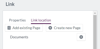
- Add existing page
- Create new page
Add Existing Page
Users can browse pages already created in the Portal Builder. Features include: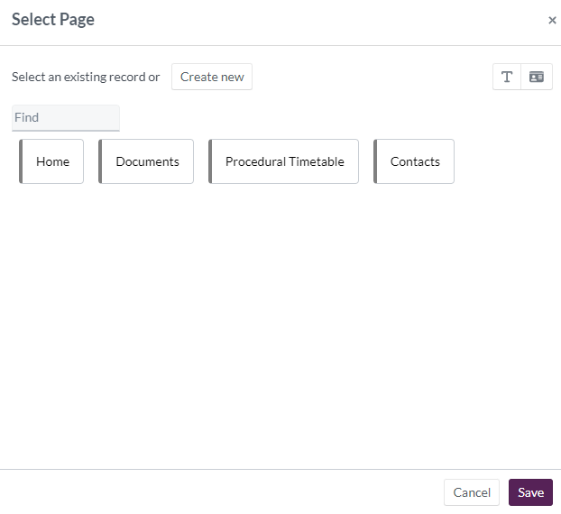
- Find option to search by page name
- Text view (named pages only)
- Card view (grid display of pages)
A single Link component can reference multiple portal pages to present additional information to users.
Create New Page
Users can create a new portal page by providing: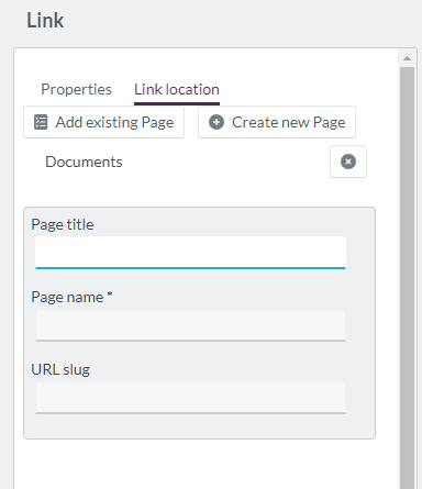
- Page title
- Page name
- URL slug
Example:
Create and link a new page titled “Help & Support” directly from the Link component.
Step 4: Configure Properties for an External Link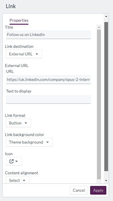
To link to an external website, configure the following options:
| Option | Explanation |
|---|---|
| Title | The title text of the link component (maximum 100 characters). |
| Link destination | Select external URL. |
| External URL | Enter the destination website URL. |
| Text to display | Descriptive text explaining the external link. |
| Link format | Display the link as a button, large button, card, or image. |
| Link background color | Select a background color from theme or custom options. |
| Icon | Choose an icon to represent the link. |
| Content alignment | Align the content left, center, or right. |
Example:
Add a button-style link titled “Visit Company Website” that directs users to an external corporate homepage.
Display example of 'link' component:
Related Links
Use the Link component to create clear, consistent navigation paths that guide users to the most relevant internal and external resources.