
| Minimum Software Version | 8.18.10 |
| Solution(s) | Cases International ✓ Cases US ✓ Institutions ⨉ Counsel ✓ |
The Documents portal component allows users to share a folder of documents with portal users, displaying the contents as a searchable and sortable list.
The Documents component presents documents stored in a specific platform folder in a list-based layout. This component is ideal when portal users need to browse, search, and review documents without requiring more advanced interaction such as uploads or subfolder management.
Administrators can control which folder is displayed, which metadata fields are visible, and how the document list is sorted and filtered. The component height can also be adjusted to suit the level of prominence required on the portal page.
Step 1: Prepare a Folder in the Platform
Before configuring the Documents component:
- Ensure the folder containing the documents has already been created in the platform.
- Confirm the folder appears as a selectable option.
Important:
Only folders that already exist in the platform can be selected for display.
Example:
Create a folder named “Reference Documents” containing policy files and guidance materials.
Step 2: Add a Documents Component
- Open the Portal Builder.
- Add the Documents component to the desired portal page.
- Open the Properties tab to configure the component.
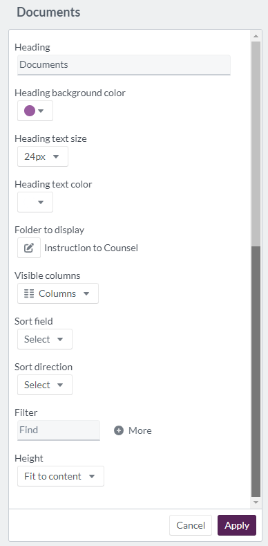
Step 3: Configure Documents Properties
Configure the following options in the Properties tab:
| Option | Explanation |
|---|---|
| Heading | Header text for the Documents component (maximum 100 characters). |
| Heading background color | Select a background color using a color wheel, hexadecimal, or RGB code. |
| Heading text size | Set header text size between 12px and 72px. |
| Heading text color | Choose header text color using a color wheel, hexadecimal, or RGB code. |
| Folder to display | Select the folder whose documents will be shared (must already exist). |
| Visible columns | Choose which metadata fields are visible to portal users. |
| Sort field | Choose either date created or date updated. |
| Sort direction | Select none, ascending, or descending. |
| Filter | Add filter conditions based on selected metadata fields. |
| Height | Set the display area to fit to content, at least half a page, or at least a full page. |
Example:
Configure a Documents component titled “Key Documents” showing document name, date updated, and document type, sorted by most recently updated.
Step 4: Portal User Document View
When displayed to portal users:
- The heading appears at the top
- Documents are listed beneath the heading
- Only selected metadata columns are visible
- Sorting and filtering rules determine document order and visibility
The layout allows users to quickly scan and access documents within the shared folder.
Example:
Portal users filter the list to view only documents updated in the last 30 days.
Display example of 'documents' component: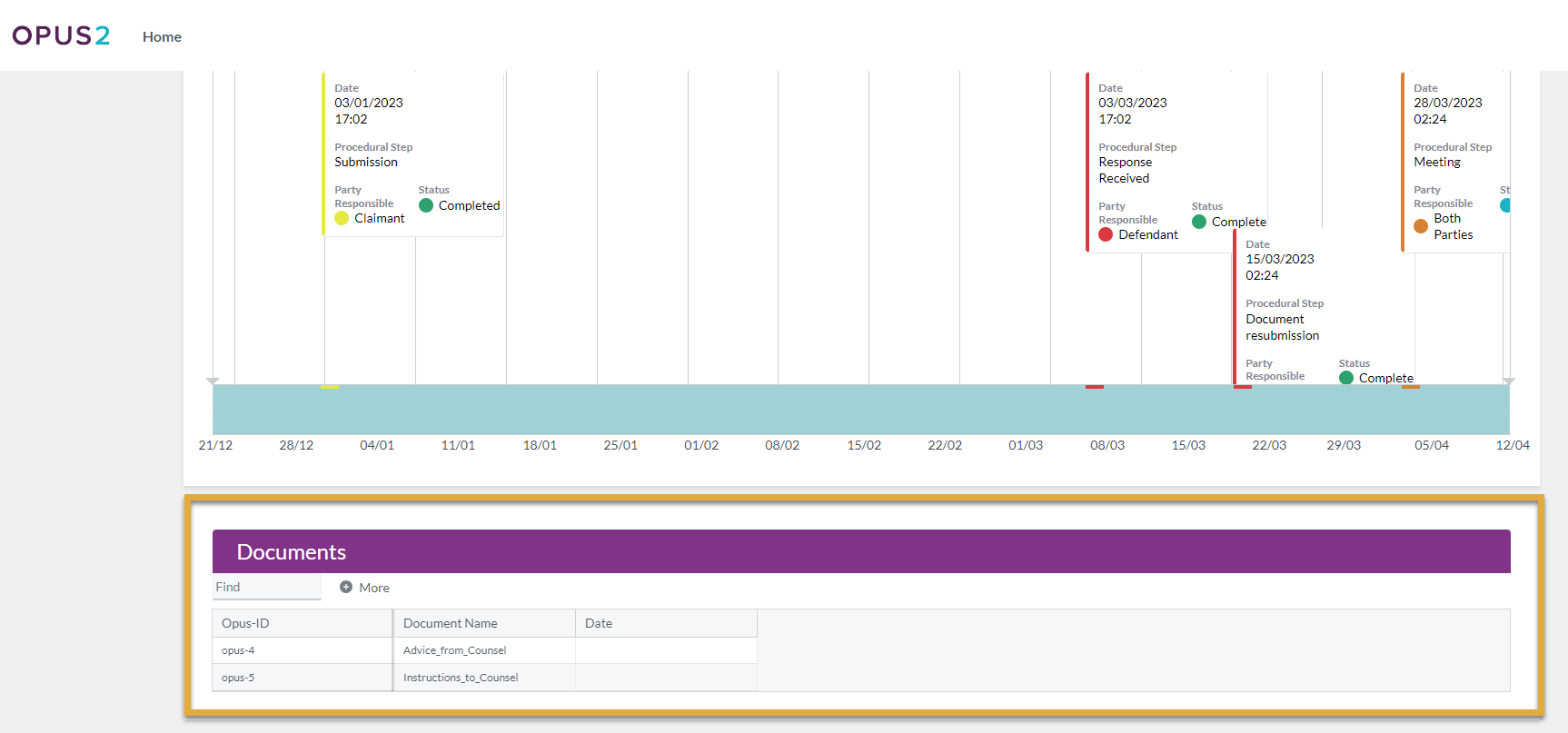
Related Links
Use the Documents component to provide portal users with a clear, structured view of shared files while maintaining control over metadata visibility, sorting, and filtering.